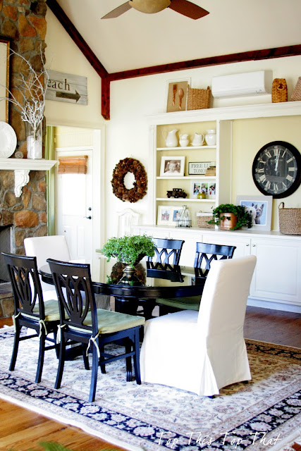
A lot of paint changes, color changes, rug changes, accessory changes and furniture changes.
All for good reason though....see this poor room had a case of mistaken identity.

And then something happened as we entered into our 8th year. It occurred to us that maybe the room was a design blunder, that maybe it would be better served in the room that was originally designed as our sunroom. You can read about that here. So we began the transition of creating what once was our family room into an extension of our kitchen, which is now our breakfast area.
During the last few years I have tried to make a space that really wasn't intended to be a kitchen seem like part of the kitchen. Truthfully it wasn't easy. Color was a huge challenge and after four changes (here) I am confident that this color is meant to be in this space. This was the space with the previous color.
Next it was time for the mantle (here) and built-in cabinets (here) to get freshened up with a lighter color as well. The contrast between the wood floors, ceiling beams and the lighter cabinetry just works in this space.
This is the view looking into the kitchen. I am working on a few other "minor" changes that will help to create more brightness in that area. You can read more about my "quest" for brightness not necessarily whiteness here.
Looking back from where we started, I am beginning to think that this blunder wasn't so bad after all.
In fact if blunders can look and act this good, maybe we can hang out and do things more often.
Grateful for~
A husband that just goes with the flow with changes like this. As long as he has a chair and a remote he doesn't care where the family room is!
Want Top This Top That delivered directly to your inbox?
It’s easy! Just enter your e-mail address.


0 comments:
Post a Comment